Strange as it may seem, Constant Image Height can be one of the most contentious topics in home theater circles, the focal point of countless arguments over screen size and shape.
Some projector owners will militantly insist that 16:9 is the only valid aspect ratio for a home theater screen. Period. The end. No room to ever consider anything else. For my part, I will admit that my own views on this can be dogmatic as well. I’ve chosen to title this article series The Philosophy of 2.35:1 Constant Image Height because it truly does amount to a philosophical question of how motion picture images should be displayed, more than just a technical matter.
In almost all cases, the argument against CIH comes down to one central misunderstanding: Why would you want to shrink 16:9 content?
In fact, you should not shrink 16:9 content when installing a 2.35:1 screen. The proper way to approach Constant Image Height is to start with a 16:9 image as large as you want it to be, and then go wider for scope content. The 16:9 center area of the screen should not compromise your enjoyment of watching sports, or playing video games, or whatever other 16:9 material you choose to project. Those things should still be as large and immersive as you can make them. However, when it comes time to watch a 2.35:1 movie (or a 2.35:1 TV show, as we’re also seeing more frequently these days), that image should then expand outward to occupy more horizontal real estate, not less vertical space.
But why? If scope movies aren’t big enough, why not just put in a larger 16:9 screen so that everything is made bigger, including those movies? Wouldn’t that also fix the problem? No, unfortunately, it doesn’t. No matter how large a 16:9 screen you install, 16:9 programming such as sitcoms, game shows, and Reality TV dating competitions will always be the largest, most immersive, most enveloping content you watch on it, dwarfing all of those very expensive blockbuster feature films we talked about earlier. When the contestants on The Bachelor look like giants towering over Luke Skywalker or Indiana Jones, what you have is less a “home theater” than an oversized TV.
That said, this article is not intended to be a critique of anyone’s taste in viewing content, merely a discussion of the best way to actually watch it. To that end, putting in an extra large 16:9 screen fails to take into account the way that motion picture images are composed.
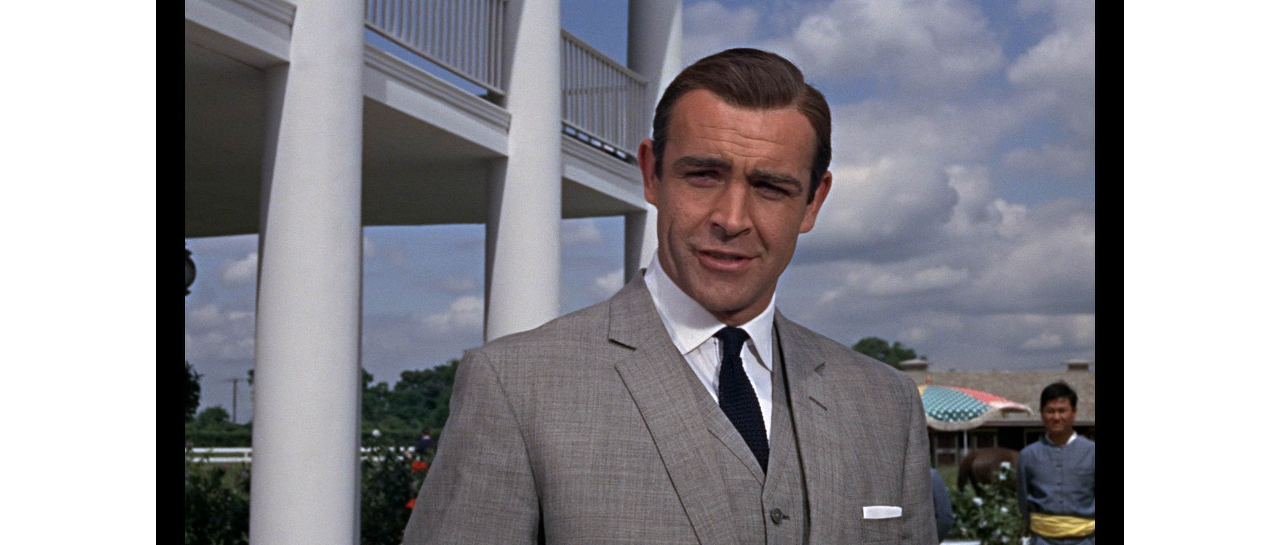
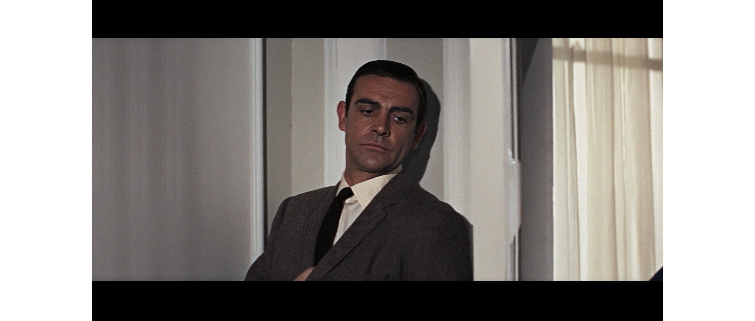
For example, let’s look at two very similar films that were framed for different aspect ratios. The early James Bond movies up to Goldfinger (1964) were photographed with spherical lenses and are preserved on home video with an aspect ratio of 1.66:1.
Starting with Thunderball (1965), the franchise (primarily, with a couple of exceptions) transitioned to using anamorphic photography for a wider scope 2.35:1 ratio.
Movie directors have no control over what size screen you watch on, whether it be a huge premium cinema or a tiny phone, but do have control over how people and objects are framed within the image. If directors want an actor to look smaller, they’ll pull their cameras back. If they want the actor to look larger, they’ll move in for a close-up. I’ve chosen these images for comparison because they both represent a classic medium shot in each format, photographed with the camera just about the same distance from the actor to frame him with the same proportions from the top of his head (including the same amount of headroom) to the middle of his chest.
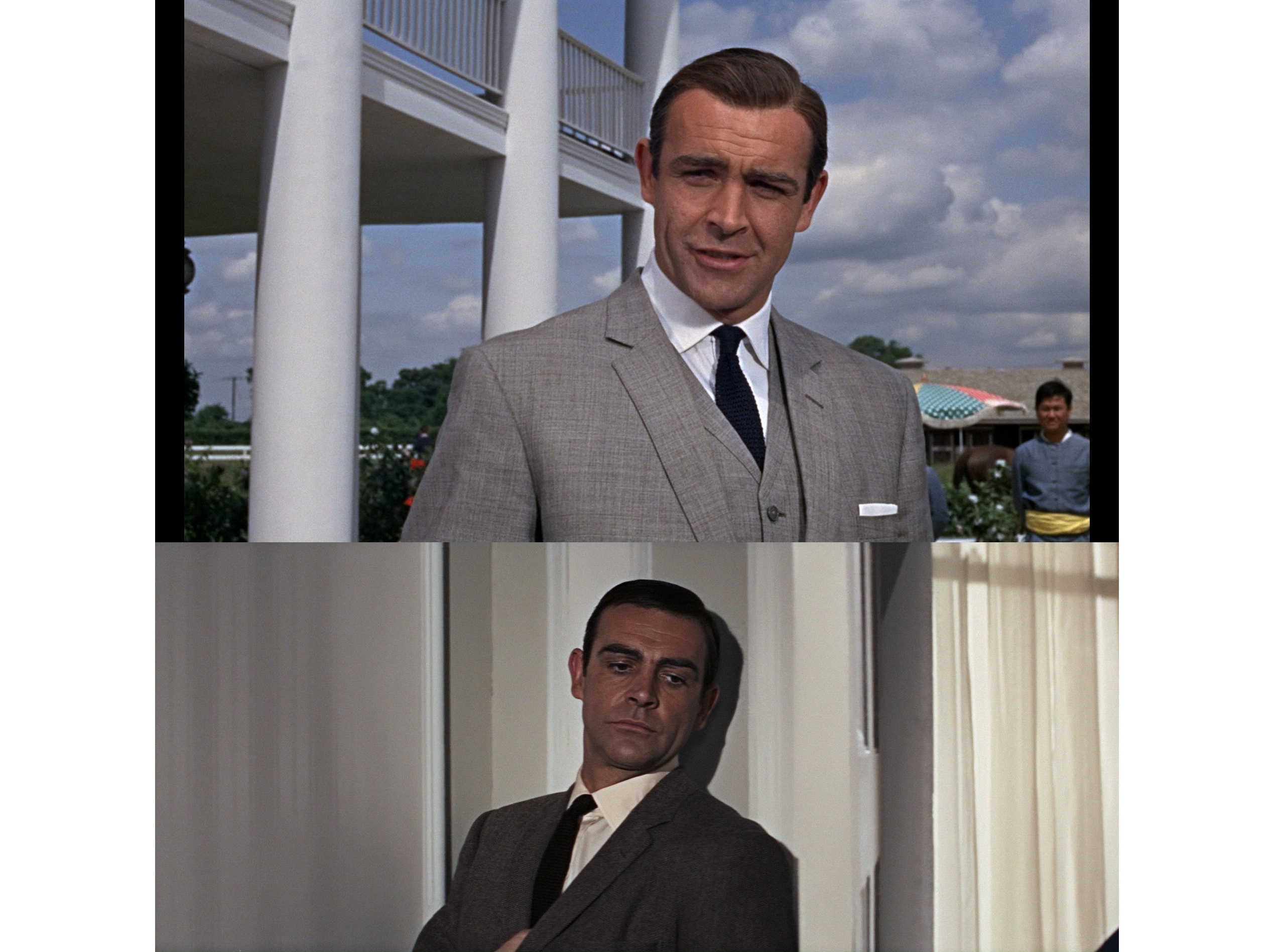
Our perception of relative size of a projected image is based on height, not on width. As viewed on a standard 16:9 television or projection screen, Sean Connery will unavoidably look much smaller in the 2.35:1 shot, despite the fact that Thunderball was actually a larger budget production with more action and spectacle. If that’s not obvious looking at the shots separately, here they are stacked directly on top of one another.
Watching these two movies on a regular 16:9 screen has the unwanted effect of making not just the actor, but everything in the 2.35:1 film feel smaller, less immersive, and less engaging than the narrower ratio that fills the height of the screen.
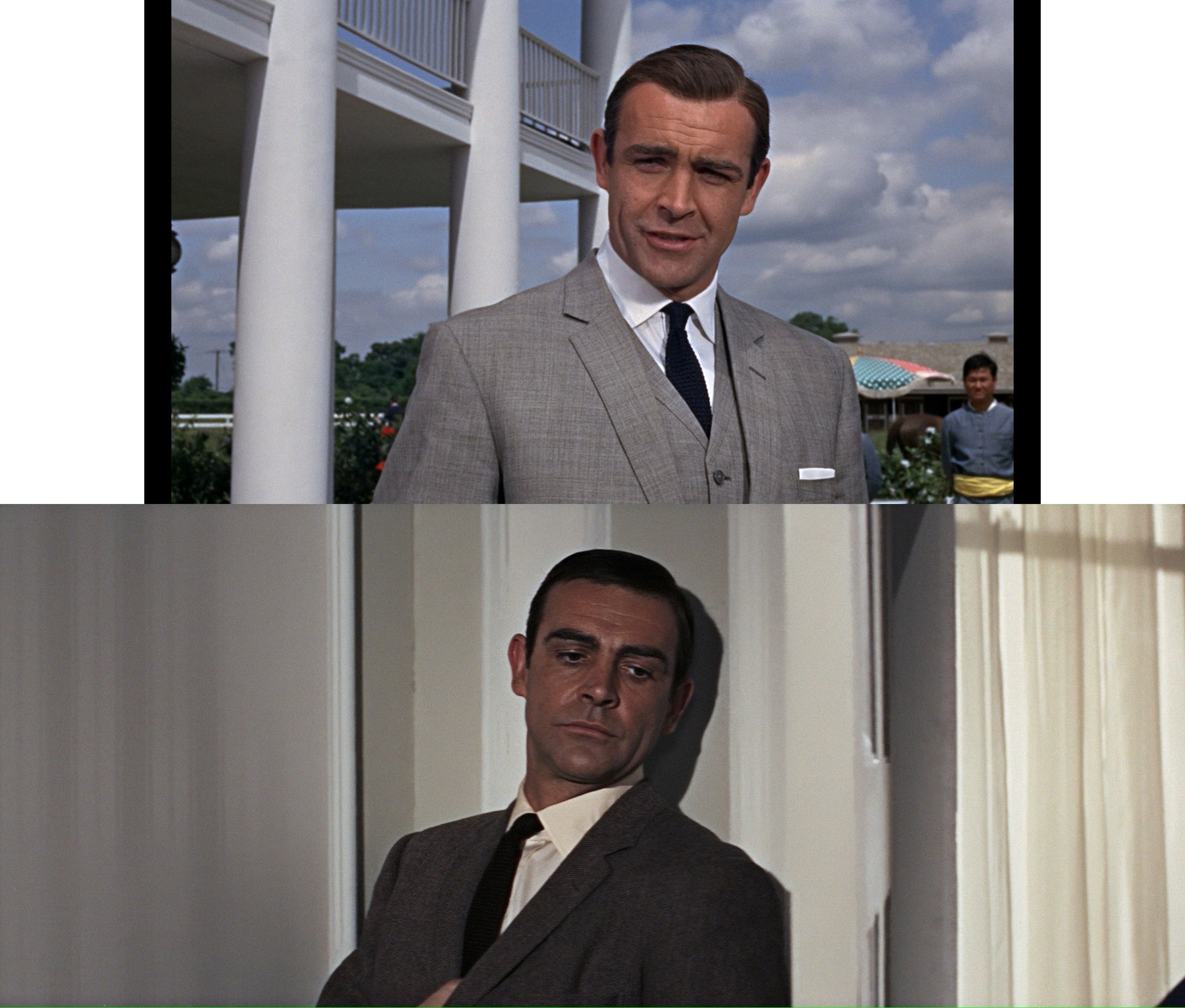
Now let’s see what happens when you scale the active image in Thunderball up to match the height of Goldfinger, allowing the extra width to expand outwards as intended.
Suddenly, Sean Connery is displayed as the same size in both shots, as he should be. This does not diminish Goldfinger at all (it’s exactly the same size as it was before!), but rather equalizes the two films so that people and objects on screen maintain comparable proportions when they’re supposed to. The main difference now is that the 2.35:1 image has more width to breathe and allow the characters move through.
Still not seeing it? Try this side-by-side extract.
In Constant Height (left and center), Connery is comparably sized in these two shots, while the 16:9 letterboxed version (far right) seems miniaturized in comparison.
Lest you think this is some arcane photography rule that only applies to movies from the 1960s, here’s a shot of recent Bond actor Daniel Craig in Spectre (2015):
Even if this may not be a 100% pixel-for-pixel size match (the camera appears to be a slight bit closer in the Spectre shot), a side-by-side comparison demonstrates that all three of these very similar medium shots appear in close scale to each other on a 2.35:1 Constant Image Height screen, whereas letterboxing on a 16:9 screen shrinks and diminishes the 2.35:1 image by a significant degree.
While some crude variation of this argument may have been used to advocate for chopping the sides off 2.35:1 movies and turning them into TV-filling 16:9, that’s a butcher’s solution with no respect for the artistry of photographic composition. A 2.35:1 Constant Image Height presentation is the best and only way to equalize the intended scale of objects on the screen while also preserving the filmmakers’ intended aspect ratio composition.


